How to Send Charts in Lifecycle Email Campaigns (Don’t Use Images!)

Product teams face a constant challenge: how do you keep users engaged after they've signed up for your app? One effective approach is to create well-crafted lifecycle email campaigns that deliver value at exactly the right moments. But here's where most teams hit a wall: traditional email builders force you to choose between boring text-only emails or image-heavy campaigns that often get blocked by spam filters.
What if there was a better way to include compelling visual data in your emails without relying on images at all?
The Power of Lifecycle Email Campaigns for Product Teams
Lifecycle email campaigns are automated email sequences triggered by specific user behaviors or milestones within your product. Unlike promotional emails that push for immediate sales, lifecycle emails focus on nurturing users through their journey with your app.
These campaigns serve multiple purposes for product teams. They guide new users through onboarding, celebrate achievements to boost engagement, re-engage dormant users, and provide valuable insights that keep users coming back. As Tim Johnson emphasized when discussing why your app needs its own culture, consistent communication through channels like lifecycle emails helps create that sense of community and ongoing value that transforms casual users into engaged community members.
The most successful product teams use lifecycle emails to create what feels like a personalized experience at scale. A fitness app might send weekly progress summaries, a productivity tool could highlight time saved, or a learning platform might celebrate course completions. The key is making each email feel relevant and valuable to the individual recipient.
Modern lifecycle campaigns go beyond simple text updates. They incorporate rich data visualizations, progress indicators, and comparative analytics that help users understand their performance and stay motivated. This is where visual elements become crucial for engagement.
Why Charts Transform Email Engagement
Data tells stories that words alone cannot convey. When users receive lifecycle emails containing charts showing their progress, usage patterns, or achievements compared to previous periods, the impact is immediate and powerful.
Consider a fitness app sending weekly progress updates. A simple text email stating "You ran 15km this week" provides information but lacks emotional impact. However, a chart showing km run over the past six weeks, highlighting improvements and patterns, creates a narrative that users find compelling and actionable.

Charts in lifecycle emails serve multiple psychological functions. They provide instant visual gratification when showing positive trends, create urgency when highlighting declining metrics, and offer social proof through comparative data. Users can quickly process visual information, making charts particularly effective for busy professionals who scan emails rapidly.
The engagement metrics speak for themselves. Emails containing visual data representations consistently achieve higher open rates, longer read times, and better click-through rates compared to text-only communications. Visual progress tracking also taps into fundamental human psychology around achievement and goal completion.
The Image Problem in Email Marketing
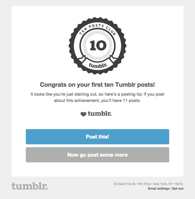
Most email builders force product teams into a problematic solution when they want to include charts: generating static images of data visualizations and embedding them in emails. This approach creates several significant issues that can severely impact campaign performance.
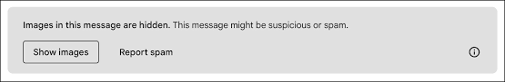
Deliverability Issues: Email providers have become increasingly aggressive about blocking images to protect users from spam and malicious content. Gmail, Outlook, and other major providers often disable image loading by default, requiring users to explicitly allow images from each sender. This means your carefully crafted charts may never be seen by a significant portion of your audience.
Accessibility Problems: Screen readers cannot interpret chart data from images, excluding visually impaired users from understanding the content. The file sizes of high-quality chart images can also slow email loading times, particularly problematic for mobile users with limited bandwidth.
Personalization at Scale: Perhaps the most significant limitation is the difficulty of generating personalized chart images for hundreds of thousands of users. Creating dynamic, user-specific visualizations requires generating individual images for each recipient and managing the hosting infrastructure to serve them reliably. This approach becomes technically and economically challenging as your user base grows.
Technical Maintenance: Static images require hosting infrastructure, create dependencies on external services, and can break if hosting locations change. They also make email templates more complex to maintain and update, as any data changes require regenerating and replacing image files.
Current Solutions and Their Limitations
Recognizing these challenges, several solutions have emerged to help teams include charts in emails without relying on traditional image embedding, but each has significant drawbacks.
API-Based Chart Services: Tools like QuickChart offer API-based services that generate chart images from URL parameters. While these eliminate some static image problems, they still rely on external image hosting and face the same deliverability challenges as traditional images. They also struggle with the personalization at scale problem.
Basic Email Builder Charts: Email service providers like Mailchimp offer basic chart creation tools, but these are typically limited to simple visualizations with minimal customization options. They also lock teams into specific platforms, reducing flexibility for growing companies.
Custom HTML/CSS Solutions: Some teams build HTML table-based chart representations, but these require significant technical expertise and are limited to very basic visualizations. They become unwieldy for complex data sets or multiple chart types.
Each solution requires teams to make compromises between visual appeal, technical complexity, deliverability, and maintenance overhead. None provides the comprehensive solution that product teams need for sophisticated lifecycle campaigns.
Trophy's Purpose-Built Solution for Lifecycle Emails
Trophy solves the chart-in-email challenge through native HTML chart blocks built specifically for the three most impactful lifecycle email use cases: achievement & milestone emails, progress recap emails, and reactivation win-back campaigns.
Rather than offering a generic chart builder, Trophy's email and push notification platform includes purpose-built chart blocks optimized for these specific scenarios. Each chart type is designed to work seamlessly with Trophy's user behavior tracking, ensuring that lifecycle emails always contain current, personalized data without manual intervention.
Achievement Unlocked Emails: Trophy's achievement chart blocks visualize milestone completion. These charts celebrate user accomplishments with engaging bar charts that dynamically highlight milestones based on each individual user’s unique journey.
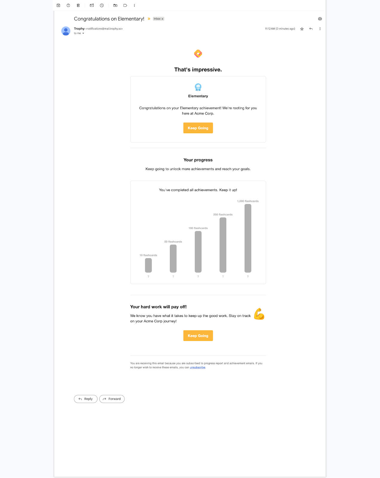
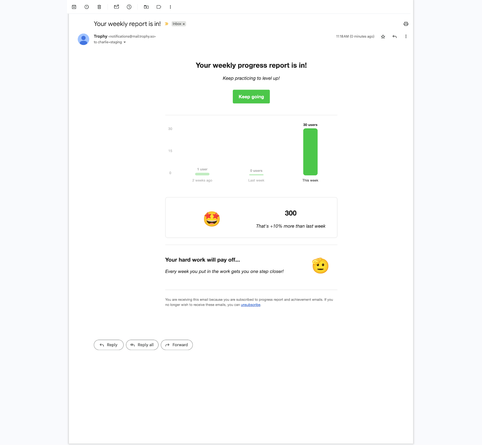
Progress Recap Emails: The progress summary charts provide comprehensive bar charts showing usage over time. These visualizations help users understand their journey and motivate them to keep growing.
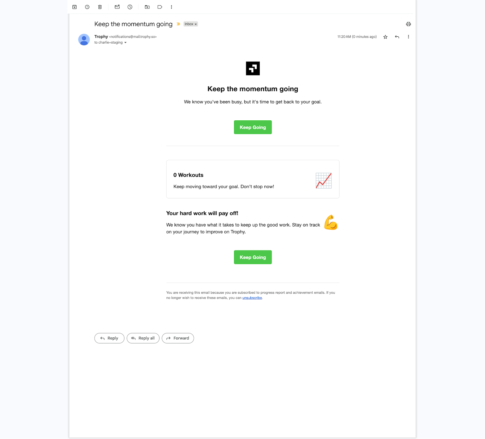
Reactivation Win-Back Emails: For re-engaging dormant users, Trophy's chart blocks highlight missed opportunities, show what users have lost during inactive periods, and demonstrate the value they could regain by returning. These charts create compelling visual narratives that motivate users to re-engage.
The key advantage is seamless integration with Trophy's behavioral tracking system. As users interact with your product, their data automatically flows into the appropriate chart blocks, enabling true personalization at scale. Whether you're sending to hundreds or hundreds of thousands of users, each recipient sees their individual data visualized in real-time.
All charts render as clean, responsive HTML and CSS optimized for email environments. They work consistently across Gmail, Outlook, Apple Mail, and mobile clients without external dependencies or deliverability concerns. Screen readers can interpret the underlying data structure, ensuring full accessibility compliance.
Beyond Charts: The Complete Lifecycle Solution
Trophy's approach addresses the broader needs of product teams building engaging user communications. The platform combines behavior tracking, segmentation, and automation tools that enable sophisticated campaign logic based on user actions within your product.
The technical simplicity also reduces the burden on engineering teams. Product managers can create and iterate on lifecycle campaigns without requiring developer resources for chart generation, email template maintenance or email client compatibility issues.
For growing companies, Trophy's architecture scales seamlessly from startup to enterprise. The same tools and workflows that work for hundreds of users continue to perform effectively with hundreds of thousands of users, solving the personalization at scale challenge that plagues image-based solutions.
Getting Started with Trophy
Trophy makes it simple to begin incorporating HTML charts into your lifecycle email campaigns. The platform offers a generous free tier that allows unlimited emails to up to 100 monthly active users, perfect for early-stage companies testing lifecycle campaign strategies.
The email builder includes pre-built chart blocks for common lifecycle email use cases: achievement celebrations, progress recaps, and win-back sequences. Teams can customize these blocks or combine them to create comprehensive lifecycle journeys that guide users from onboarding through long-term engagement.
To learn more about building effective lifecycle campaigns that create app culture and drive retention, check out our detailed guide on how to design gamified lifecycle emails with Trophy.
Transform Your Lifecycle Email Marketing Today
The future of lifecycle email campaigns lies in rich, personalized communications that provide genuine value to users. HTML charts represent a crucial component of this evolution, enabling product teams to share compelling data insights without the technical limitations and deliverability issues of image-based approaches.
Trophy's purpose-built email builder solves the chart-in-email challenge while providing a complete platform for sophisticated lifecycle campaigns. Whether you're just beginning to explore lifecycle marketing or looking to upgrade from basic email tools, Trophy offers the capabilities needed to build truly engaging user communications at scale.
Start building better lifecycle email campaigns today with Trophy's free tier. Experience the difference that native HTML chart blocks make for user engagement and see why leading product teams are choosing Trophy for their lifecycle marketing needs. Sign up now and send unlimited emails to up to 100 monthly active users at no cost.
Get the latest on gamification
Product updates, best practices, and insights on retention and engagement — delivered straight to your inbox.