
Spotify Wrapped generates more social media buzz in early December than most marketing campaigns achieve all year. Users eagerly share their personalized year-end summaries, creating millions of organic impressions.
Now everyone from Duolingo to Strava runs their own wrapped campaigns, and for good reason: wrapped features consistently deliver the highest engagement rates of any product feature.
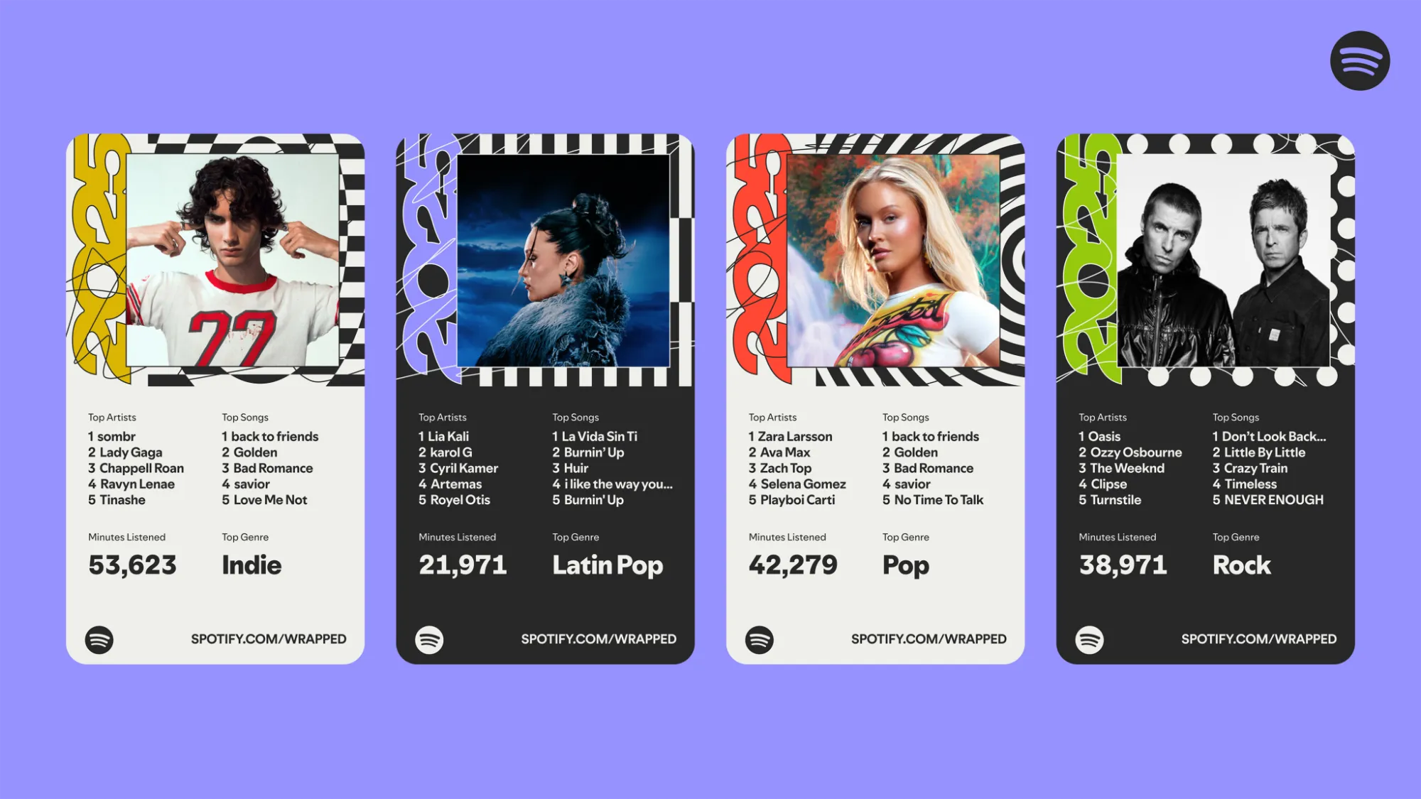
The wrapped concept works because it transforms boring usage data into shareable stories. Users get a compelling reason to return to your app, reflect on their progress, and broadcast their achievements to friends.
But building a wrapped feature requires more than pretty graphics; it demands robust infrastructure to track user behavior accurately over time and aggregate insights at scale.
What Makes Wrapped Features Effective
Wrapped features tap into three psychological drivers simultaneously.
- First, they provide social proof through personalized achievements worth sharing.
- Second, they create FOMO when users see friends' wrapped summaries and realize they're missing out.
- Third, they drive reflection and goal-setting by showing progress over time.
Spotify pioneered this format in 2016 with simple top artist rankings. Within years, every major consumer platform adopted variations: GitHub shows coding contributions, Grammarly highlights writing statistics, Apple Music compiles listening habits. This works across categories because the core mechanic of personalized data visualization prompting social sharing holds true in almost any consumer segment.
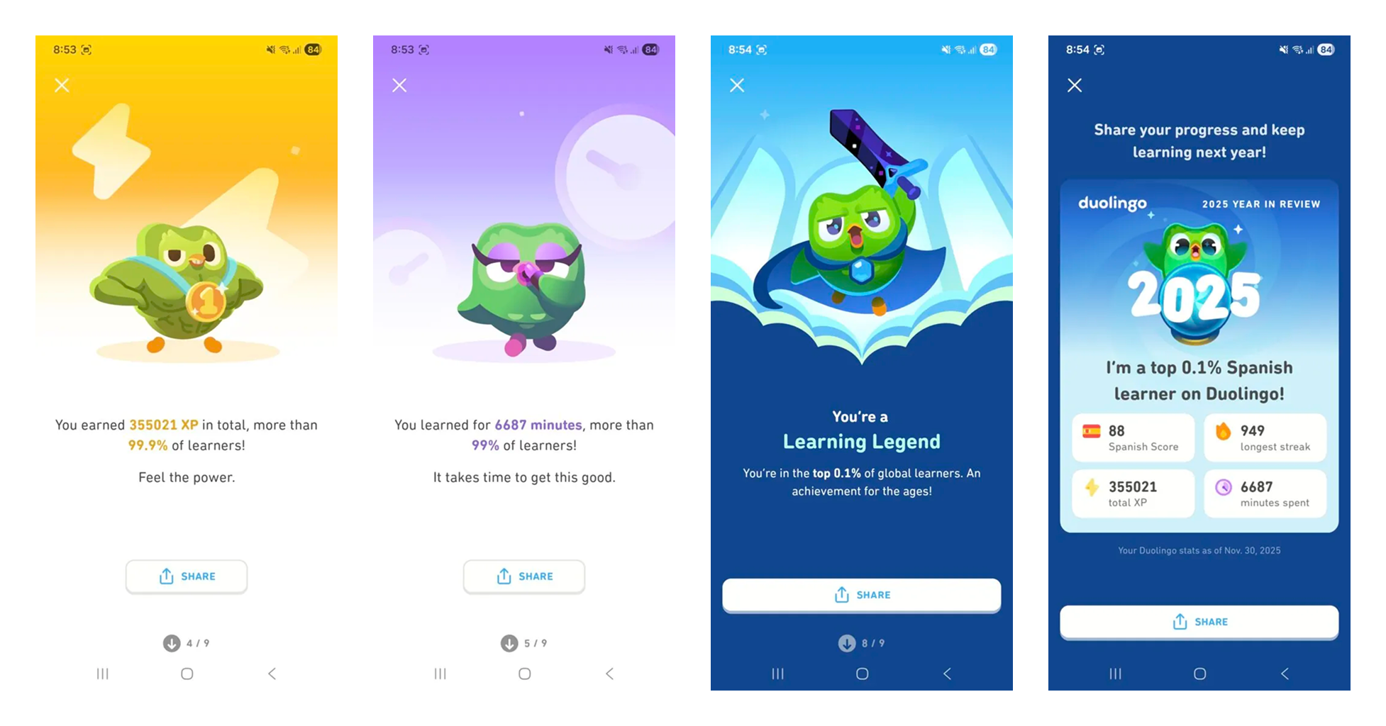
However, wrapped can be complex technical challenge. But given the growing investment from most major platforms, it's clear the business impact justifies the development effort.
Wrapped features generate massive spikes in daily active users as churned users return to see their summaries. They also:
- Create organic viral loops as shared content drives new user acquisition.
- Provide natural conversation starters for re-engagement campaigns.
- And generate valuable retention signals by identifying which users remain engaged enough to care about their annual summary.
Anatomy of a Wrapped Feature
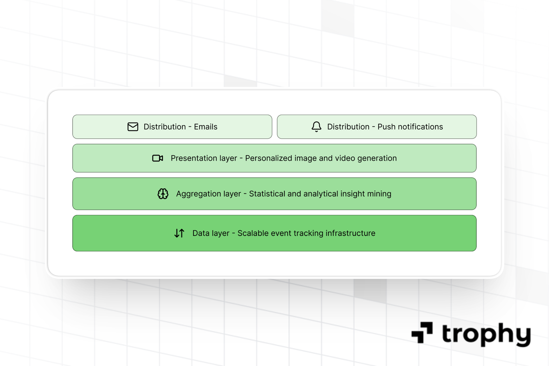
It's useful to build a mental model of a wrapped feature as consisting of 4 main layers.
1. The Data Layer
The data layer is the bedrock of a wrapped feature and consists of scalable event-based user interaction tracking infrastructure capable of capturing and attributing user actions year-round.
2. The Aggregation Layer
The aggregation layer is responsible for turning the raw data from the data layer into useful, highly personalized insights that can be used be build a compelling product feature.
3. The Presentation Layer
The presentation layer can be image or video, and is responsible for taking the insights from the aggregation layer and building a delightful user experience that creates high engagement and promotes organic social sharing.
4. The Distribution Layer
Finally the distribution layer is responsible for pushing the finished feature in front of as many eyeballs as possible.
It usually consists of a combination of email and push notifications used to announce and continually engage users with the wrapped feature over the course of the release.
How To Build A Wrapped Feature
Here we'll go into more detail on the steps you should take to build your own wrapped feature for your app. If you're looking for platforms for building your own wrapped feature read this full comparison of the tools and SDKs you can use to build your own wrapped feature.
Step 1: Define Your Core Metrics
Building wrapped starts with identifying which user behaviors actually matter. Don't track everything or your aggregation step will be near-impossible–just focus on 3-5 metrics that represent meaningful engagement with your core product value.
For a language learning app like Duolingo, this might be lessons completed, vocabulary words learned, and flashcards reviewed. For a fitness app, workouts logged, personal records set, and training consistency. For a reading app, books finished, pages read, and genres explored.
The metrics should tell a compelling story about how users spent their time in your app. Generic numbers like "total sessions" rarely resonate. Specific accomplishments like "climbed the equivalent of Mount Everest" ground statistics in users' minds.
A few key points:
- Consider both cumulative metrics (total distance run) and achievement-based milestones (fastest mile time).
- Mix quantitative data (200 workouts) with qualitative insights (most active on Tuesday mornings).
- Include social comparisons where relevant (top 5% of readers) but avoid making users feel inadequate.
Step 2: Build Event Tracking Infrastructure
Wrapped features demand comprehensive historical data. You can't decide in November to build wrapped for December if you haven't been tracking user interactions all year. Every relevant user action needs to be captured as a structured event with proper timestamps and metadata.
Trophy provides the event tracking infrastructure that wrapped features require. When users interact with your app, Trophy records these interactions as events against your configured metrics, automatically handling the data persistence, aggregation, and time zone management that wrapped features depend on.
The event structure matters significantly. Each event should capture not just what happened, but relevant context. A workout event needs duration, type, and intensity. A reading event needs book title, page count, and session duration. This contextual data enables the sophisticated insights that make wrapped summaries compelling.
Time zones also add significant complexity as a user in Tokyo and a user in New York have different calendar years. Trophy automatically handles this by tracking user time zones and ensuring tracked events align with each user's local calendar, so December 31st means the same thing regardless of location.
Step 3: Create the Aggregation Layer
Raw event data needs intelligent aggregation to generate wrapped insights. This layer computes statistics, identifies patterns, and surfaces interesting findings from millions of individual events.
The aggregation logic runs in two phases. First, it calculates basic statistics: totals, averages, maximums. How many lessons did this user complete? What was their longest streak? When were they most active?
Second, it generates comparative insights. How does this user rank among all users? What percentile are they in for each metric? Which behaviors make them unique? These comparisons create the social proof that drives sharing.
Trophy's wrapped API handles this aggregation automatically. It processes your tracked events to generate comprehensive wrapped data for each user, including rankings, comparisons, and trend analysis. You define which metrics matter, and Trophy computes the statistics.
However the real challenge lies in performance at scale. Computing wrapped data for millions of users requires careful optimization. Precomputation helps, where calculate aggregate statistics once rather than on-demand for each user saves load at release. Similarly caching prevents redundant calculations and incremental updates avoid reprocessing unchanged data.
Step 4: Design the Presentation Layer
The visual presentation transforms data into shareable content. This is where wrapped features differentiate themselves—same underlying data, completely different execution.
Spotify uses animated slides with bold typography and gradients. Duolingo shows a progression of achievements with character illustrations. Strava displays maps of where users exercised. The format should reflect your brand identity while optimizing for social sharing.
Consider both static images and dynamic formats with images working universally across all social platforms but lacking in interactivity and videos allowing for more complex storytelling but encounter performance constraints. Interactive web experiences enable exploration but don't share as cleanly on mobile-first platforms.
Trophy currently focuses on the infrastructure and data layer rather than the presentation UI. Customers build their own visual experiences as images, videos, or interactive web pages using the data Trophy's wrapped API provides. This approach allows complete design flexibility while Trophy handles the complex data tracking and aggregation.
Step 5: Build Delivery Architecture
Getting wrapped summaries to users requires thoughtful distribution including notifying users when their summary is ready, providing easy access within your app, and optimizing opportunities for social sharing.
Most platforms send push notifications or emails when wrapped becomes available, creating urgency and FOMO. The notification should tease interesting findings ("Your 2025 was incredible—see why") rather than generic announcements.
Within your app, wrapped should be prominently featured but not mandatory. Some users will dive in immediately, others prefer to explore at their own pace. A dashboard entry point works well, as does a temporary banner during the wrapped campaign period.
Social sharing mechanics can turn a 'nice to have' wrapped feature into a viral growth hack. Make it trivially easy to share to Instagram Stories, Twitter, LinkedIn, and other relevant platforms from directly within your app. Consider using pre-populated share text with compelling hooks and ensure shared images include your branding to drive attribution.
Consider timing carefully. Spotify runs wrapped in early December, catching the year-end reflection mood without competing with holiday chaos while other platforms spread throughout the year with GitHub doing November. Each year test what timing generates maximum engagement for your audience.
The Data Pipeline: Aggregating User Activity Into A Recap
Your wrapped feature lives or dies on the aggregation layer. Raw event data (every lesson completed, every workout logged, every article read, every session started) needs to become a handful of meaningful stats: totals, streaks, personal bests, and comparisons against the user base.
The core operation is a windowed aggregation. You query all events for a user within your recap window (usually the calendar year), group them by metric, and compute rollups. Here's what that looks like in SQL:
WITH user_events AS (
  SELECT
    user_id,
    event_type,
    event_value,
    event_timestamp
  FROM events
  WHERE event_timestamp >= '2024-01-01'
    AND event_timestamp < '2025-01-01'
),
user_totals AS (
  SELECT
    user_id,
    COUNT(*) AS total_events,
    SUM(event_value) AS total_value,
    MAX(event_value) AS peak_value,
    COUNT(DISTINCT DATE(event_timestamp)) AS active_days
  FROM user_events
  GROUP BY user_id
),
percentiles AS (
  SELECT
    user_id,
    total_events,
    total_value,
    peak_value,
    active_days,
    PERCENT_RANK() OVER (ORDER BY total_events) AS events_percentile
  FROM user_totals
)
SELECT
  user_id,
  total_events,
  total_value,
  peak_value,
  active_days,
  ROUND(events_percentile * 100, 1) AS top_percent
FROM percentiles
WHERE user_id = :target_user_id;
This query computes four stats (total events, total value, peak value, active days) plus a percentile rank against all users. The PERCENT_RANK() window function handles the "you were in the top 5%" comparison without a second pass.
At scale, you won't run this on demand. Precompute results during off-peak hours and cache them in a fast key-value store (Redis, DynamoDB). If your event volume is high, consider incremental updates: recompute only users with new activity since the last batch run rather than the full table.
Trophy's wrapped API handles this aggregation for you. It runs the windowed queries across your tracked events, computes percentiles against your user base, and returns a structured recap object. The SQL above is roughly what it does under the hood.
Building The Story-Style UI
The aggregated stats need a delivery format. The Spotify-style story sequence (full-screen slides with tap-to-advance and a progress bar) works because it controls pacing and builds suspense.
You have four format options. Static images are the simplest to build and share, but they feel flat. Pre-rendered video is polished and viral-ready, but production cost is high and personalization is limited. Animated video (motion graphics templated per user) improves personalization but adds rendering infrastructure. Interactive UI (the story approach) balances polish with flexibility: you render components dynamically, so every user sees their own data without generating millions of video files.
Here's a minimal React component for a story-style wrapped viewer:
import { useState } from 'react';

function WrappedStory({ slides }) {
  const [index, setIndex] = useState(0);
  const slide = slides[index];

  const advance = () => {
    if (index < slides.length - 1) setIndex(index + 1);
  };

  const goBack = () => {
    if (index > 0) setIndex(index - 1);
  };

  return (
    <div
      className="wrapped-container"
      onClick={(e) => {
        const x = e.nativeEvent.offsetX;
        const width = e.currentTarget.offsetWidth;
        x < width / 3 ? goBack() : advance();
      }}
    >
      {/* Progress indicator */}
      <div className="progress-bar">
        {slides.map((_, i) => (
          <div
            key={i}
            className={`segment ${i <= index ? 'filled' : ''}`}
            style={{ width: `${100 / slides.length}%` }}
          />
        ))}
      </div>

      {/* Slide content */}
      <div className="slide">
        <h1>{slide.headline}</h1>
        <p className="stat">{slide.value}</p>
        <p className="caption">{slide.caption}</p>
      </div>
    </div>
  );
}

// Usage
const recapSlides = [
  { headline: 'Your Year', value: '2024', caption: 'Here is what you did.' },
  { headline: 'Sessions', value: '312', caption: 'You showed up 312 times.' },
  { headline: 'Top 4%', value: '🏆', caption: 'More than 96% of users.' },
  { headline: 'Longest Streak', value: '23 days', caption: 'Your best run.' },
];

<WrappedStory slides={recapSlides} />
The component takes a slides array (each slide has a headline, a value, and a caption) and renders one at a time. Tapping the left third goes back; tapping anywhere else advances. The progress bar fills as the user moves through.
Add swipe gestures with a library like react-swipeable if you need mobile-native feel. For shareability, render a static image of the final slide using html2canvas or a server-side screenshot service.
Spotify's Licensing And Commercial Restrictions
Before you build a Wrapped feature on Spotify's data or SDKs, read the fine print. Spotify's platform is free to prototype against, but shipping a commercial product on it means inheriting Spotify's rules. Three restrictions matter most.
First, the Web Playback SDK carries a commercial-approval requirement. Spotify's Web Playback SDK documentation states the SDK must not be used in commercial projects without Spotify's prior written approval. You can build a prototype and test it internally. Shipping a monetized product on top of it means going through Spotify's approval process first.
Second, Spotify limits how you store and aggregate its content, and it bans reselling data pulled from the API. Spotify's Compliance Tips list repackaging data gathered from the API and selling it to businesses as a disallowed use. A Wrapped feature depends on the opposite pattern: a full year of listening data, aggregated and held until December. That collides directly with the policy.
Third, you cannot train models on Spotify content. Spotify's Developer Terms prohibit using the Spotify Platform or any Spotify Content to train a machine learning or AI model, or otherwise ingesting Spotify Content into one. If you planned to build personalization or recommendation models on top of listening data, that path is closed.
None of this makes Spotify a bad choice. For plenty of apps, the Spotify path is fine. But building on someone else's music data means playing by someone else's rules.
A first-party approach changes the math. Trophy tracks and aggregates your product's own engagement data: lessons completed, workouts logged, sessions run, streaks kept. You own that data outright. You can store it for as long as you want and aggregate it across the full year. You can train models on it too, because none of Spotify's restrictions touch data you generated yourself.
Building A Wrapped Feature With Trophy
Trophy provides the foundational infrastructure wrapped features require: scalable event tracking, automatic data aggregation, time zone handling, and a dedicated wrapped API. This lets you focus on the creative aspects like visual design, narrative structure, social optimization while Trophy handles the complex data engineering.
Trophy's wrapped API improves each year to support more use cases and provide richer insights. While we don't currently provide presentation layer UI components, our roadmap includes expanding wrapped capabilities based on customer feedback and emerging wrapped trends.
Implementation with Trophy typically takes one to two weeks including setting up event tracking for your key metrics, integrating the wrapped API, and building your custom presentation layer. This timeline assumes you start tracking events well before your wrapped launch date, as historical data is essential.
It is possible to import historical data into Trophy to support teams that might not have been using Trophy for a full calendar year to still be able to deliver a compelling wrapped experience.
Trophy's pricing is based on monthly active users, so wrapped campaigns don't create unexpected cost spikes. You pay only for users actively engaging with your app over the course of your calendar year, and don't pay for churned users who don't access your wrapped feature.
Common Implementation Challenges
Here are some common challenges that product teams face when building wrapped features:
- Historical data gaps that prevent comprehensive summaries.
- Data quality issues that create embarrassing errors in personalized summaries.
- Performance problems causing timeouts when millions of users access wrapped simultaneously.
- Comparative rankings needing thoughtful framing to avoid making users feel bad about their progress.
- New users with minimal data need different treatment than power users.
- Deleted accounts shouldn't appear in comparisons.
- Users who changed behavior dramatically (stopped using your app, then returned) need context in their summaries.
Using a gamification platform like Trophy year-round takes away the complex data engineering challenges and helps teams stays focused on creatives and deliver wrapped features in less time.
Best Practices and Design Patterns for a Yearly Recap
The build steps above get you a working recap. These patterns help you build one worth sharing.
Data-Modeling Best Practices
Track events, not aggregates. Store each user action as a timestamped event with metadata (activity type, duration, category, content ID). Raw events let you slice data later. Pre-aggregated totals lock you into one view.
Pre-compute per-user rollups. Run nightly or weekly jobs that calculate cumulative totals, streaks, and category breakdowns for each user. When recap season hits, you query a summary table instead of scanning a year of raw logs.
Pick four or five headline metrics. Spotify Wrapped highlights total minutes, top artists, and top genres. Duolingo Year in Review focuses on lessons completed and words learned, along with XP earned and streak length. More metrics dilute impact. Choose the numbers your users will want to screenshot.
Mix absolutes with comparisons. A cumulative total ("You ran 847 miles") is meaningful on its own. A percentile ("You ran more than 94% of Strava users") adds social proof. A milestone ("You hit 1,000 XP for the first time in March") adds narrative. Combine these for a recap that feels personal and shareable.
Recap Design Patterns
Sequential full-screen story slides. Spotify and Instagram popularized this format: one stat per screen, swipe to advance. It forces focus and works natively on mobile.
One-stat-per-card with a big number. Each card shows a single metric in large type with a short caption below. Duolingo Year in Review uses this pattern for XP and streak stats.
Build to a headline stat. Open with smaller wins, escalate through the sequence, and land on your biggest number last.
Percentile and social-comparison cards. "You're in the top 5% of listeners" or "You learned more words than 88% of users." Strava's Year in Sport recap takes a related angle, surfacing personalized insights, social engagements, and stand-out moments from your year. If you use Trophy's leaderboard APIs, you already have the ranking data to power percentile cards.
Shareable branded summary card. End with a single image that combines four or five stats, the user's name or avatar, and your logo. This is the card users post to Instagram Stories or LinkedIn. Make it visually complete without extra context.
Frequently Asked Questions
How far in advance should we start tracking data for wrapped?
Wrapped requires comprehensive historical data, ideally a full calendar year, minimum six months. You can't retroactively create data you didn't track. Trophy makes it easy to start tracking events right away, so even if you're planning wrapped for next December, begin implementation now.
What if users haven't used our app much and their wrapped looks empty?
It's important to design for variable engagement levels, and Trophy's wrapped API provides data to support this. Create different views for power users versus casual users. Highlight any activity, even minimal usage, as positive. Frame low engagement optimistically ("Room to grow in 2025!") rather than negatively.
Lastly, consider minimum thresholds, if users didn't engage enough for meaningful insights, or signed up just before launch, perhaps they don't need wrapped.
How do we handle users who joined partway through the year?
Adjust timeframes based on account age. A user who joined in August gets a five-month summary, not a full year. Clearly communicate the date range covered. Consider celebrating their join date as part of their wrapped story, for example "You've been with us for 147 days!"
Should wrapped be limited to annual summaries or can we do quarterly or monthly versions?
Annual wrapped works universally because it's rare enough to feel special. Monthly wrapped can work for high-frequency apps (daily fitness tracking) but risks fatigue. Almost all apps should stick to annual if in doubt.
However, monthly progress reports or usage summaries can be a great way to keep users in touch with their progress year-round.
What's the minimum viable wrapped feature we can launch?
Start with three core metrics and simple visual presentation. Focus on getting the infrastructure right with accurate data tracking, reliable aggregation, smooth delivery. You can always enhance visuals in future years, but poor data quality or technical issues during launch create lasting negative impressions.
Or use Trophy to skip the infrastructure complexity, so you can focus on narrative and design.
How do we encourage users to share their wrapped summaries?
Make sharing frictionless i.e. one tap should generate a shareable image optimized for each platform. Include intriguing insights that prompt conversation ("Top 1% of readers"). Add your branding subtly so shares drive attribution without feeling like ads.
What data should a Wrapped-style recap track?
Track timestamped events, not just totals. Each event should include the action type, a timestamp, and relevant metadata (category, duration, content ID, session context). This gives you flexibility to calculate new metrics later. From raw events, pre-compute per-user rollups: cumulative counts, category breakdowns, streaks, and personal bests. Pick four or five headline metrics that map to what users care about. Spotify Wrapped uses total minutes, top artists, and top genres. Duolingo Year in Review tracks lessons and words learned, plus XP and streak length. More metrics dilute the story.
How far back should the recap window go?
Most year-in-review features use a calendar year (January 1 to December 31) or a trailing 12 months. Spotify Wrapped tracking runs from January through roughly early November each year. The key constraint is lead time: you need aggregation and design work done before your launch window. If you're building your first recap, start tracking events at least six months before you plan to ship. For users who joined mid-year, show their stats since signup and frame it honestly ("Your first 4 months on the app").
What are common design patterns for year-in-review stories?
Four patterns dominate. Sequential full-screen slides (Spotify, Instagram) show one stat per swipe. One-stat-per-card layouts pair a big number with a short caption (Duolingo). Percentile cards add social comparison ("Top 5% of listeners"). A shareable summary card combines key stats with the user's name and your branding into one image built for Instagram Stories or Twitter. Most recaps mix two or three of these. Start with full-screen slides and a summary card.
card.
Can I get Spotify listening data for free, and what are the limits?
Yes, the Spotify Web API is free to call. The limits come from the mode your app runs in.
A new app starts in development mode. Under Spotify's February 2026 changes, that mode caps you at 5 authenticated users per app. You add each user to an allowlist by hand, and the app owner needs an active Spotify Premium subscription.
To lift that cap you apply for extended quota mode. Spotify grants it only to established organizations: a legally registered business with a launched service and at least 250,000 monthly active users. App review can take up to six weeks.
If you build a Wrapped-style recap on your own in-app engagement data, none of these limits apply. Our tools-to-build comparison covers the full trade-off.
Do I need Spotify's approval to use its data commercially?
Yes. Commercial use is restricted, and two rules matter most.
The Web Playback SDK cannot be used in a commercial project without Spotify's prior written approval.
Spotify's Developer Terms (v10, effective May 15, 2025) add two more limits. You cannot aggregate Spotify Content beyond what your app needs to run. You also cannot use that Content to train or feed an AI or ML model.
This is why many teams building a Wrapped-style recap track their own in-app activity instead of Spotify's data. Our tools-to-build comparison walks through the options.
Get the latest on gamification
Product updates, best practices, and insights on retention and engagement — delivered straight to your inbox.
The gamification layer for consumer apps
Drop-in gamification features you can ship this sprint. Increase retention and user engagement without sacrificing your roadmap.
 Book a call