How To Use Charts In Emails (Without Images)

Creating visually appealing charts in emails can provide a drastic boost in engagement. However, most email builders force you to choose between boring text-only emails or image-heavy campaigns that often get blocked by mailbox spam filters.
What if there was a better way to include compelling visual charts in your emails without relying on images at all?
Why Charts Transform Email Engagement
Charts in emails serve multiple psychological functions. They provide visual gratification when showing positive trends, create urgency when highlighting decline, and offer alternative viewpoints when using comparative analysis. Busy recipients can quickly process visual information, making charts particularly effective for those who scan emails rapidly.

What’s more, emails containing charts often achieve higher open rates, longer read times, and better click-through rates compared to text-only copy. Visual data tracking also taps into fundamental human psychology around achievement and progression.
The Image Problem in Email Marketing
Most email builders quickly create problems for product teams when they want to include charts: generating static images of data visualizations and embedding them in emails. This approach creates several significant issues that can severely impact email engagement.
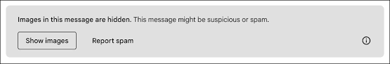
Deliverability Issues: Mailbox providers have become increasingly aggressive about blocking images to protect users from spam and malicious content. Gmail, Outlook, and other major providers often disable image loading by default, requiring users to opt-in to allowing images from senders. This means charts may never be seen by a significant portion of your audience.
Accessibility Problems: Screen readers cannot interpret images, excluding visually impaired users from understanding the content. The file sizes of high-quality chart images can also slow down email load times, causing frustration for mobile users with limited bandwidth.
Personalization at Scale: Perhaps the most significant issue is the difficulty of personalizing image charts at scale. Creating dynamic, specific visualizations for hundreds of thousands of users requires generating individual images for each recipient and managing the hosting infrastructure to serve them reliably. This approach becomes technically challenging as your user base grows.
Technical Maintenance: Static images require hosting infrastructure, create dependencies on external services, and require continual maintenance by development teams. They also make email templates more complex to maintain and update, as any data changes require regenerating and replacing image files.
Current Solutions and Their Limitations
Recognizing these challenges, several solutions have emerged to help teams include charts in emails without relying on traditional image embedding, but each also have their own drawbacks.
API Chart Services: Tools like QuickChart offer API-based services that generate chart images from URLs. While these eliminate some problems, they still rely on external image hosting and face the same deliverability challenges as traditional images. They also struggle with offering full control over styling so emails may not always reflect your brand.
Basic Email Builder Charts: Email infrastructure providers like Mailchimp offer basic chart creation tools, but these are typically limited to simple visualizations with minimal customization options.
Custom HTML/CSS Solutions: Some teams build custom HTML table-based chart representations, but these become unwieldy for complex data sets or multiple chart types and require constant back and forth changes with development teams.
Each solution requires teams to make compromises between visual appeal, technical complexity, deliverability, and maintenance overhead. None provides the comprehensive solution that product teams need for sophisticated email charts as scale.
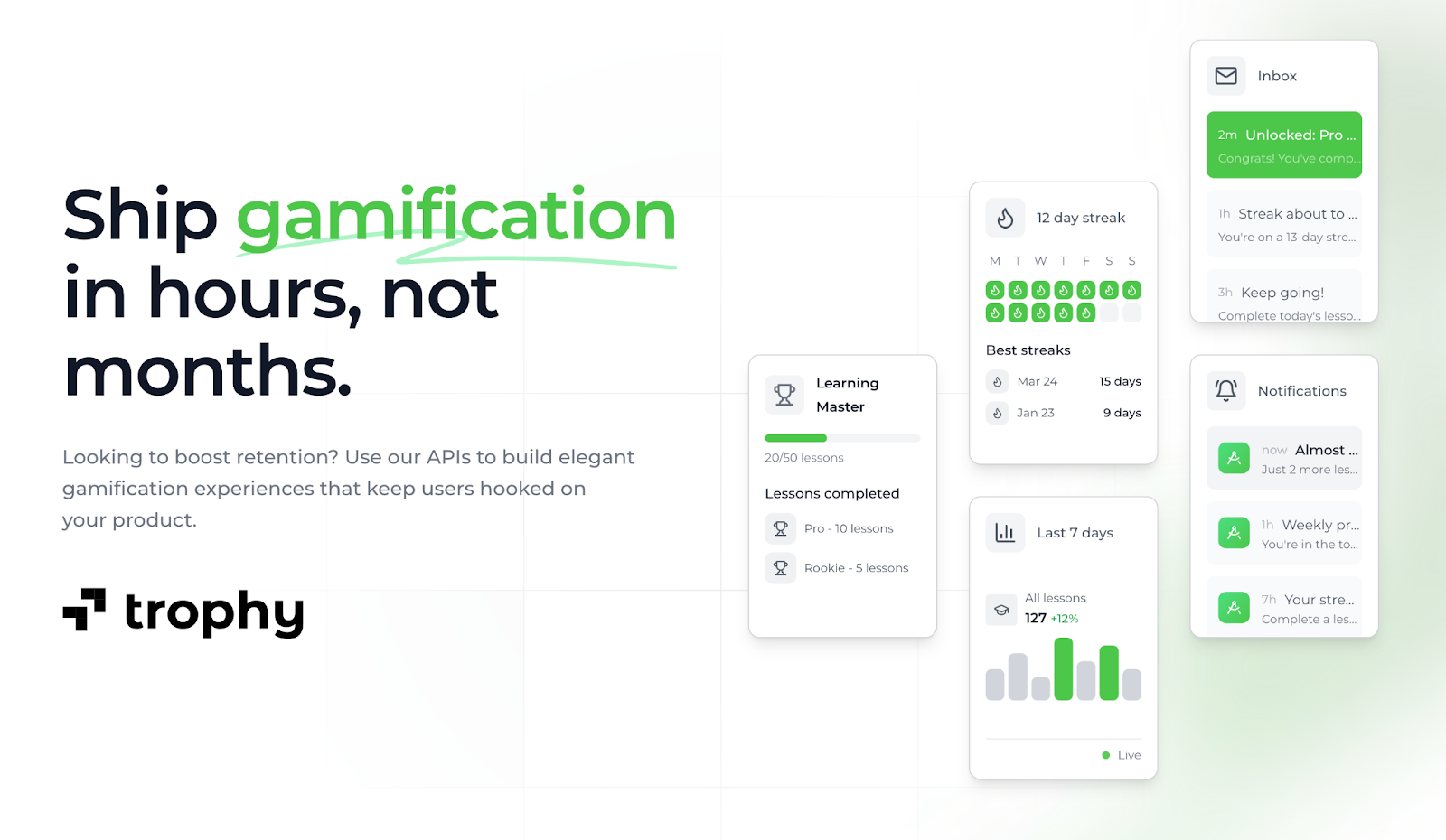
Trophy's Purpose-Built HTML Email Charts
Trophy solves the chart-in-email problem through native HTML chart blocks. Rather than offering a generic chart builder, Trophy's email and push notification platform includes purpose-built chart blocks optimized for specific scenarios. Each chart type is designed to work seamlessly with Trophy's user behavior tracking, ensuring that emails always contain relevant, personalized data.
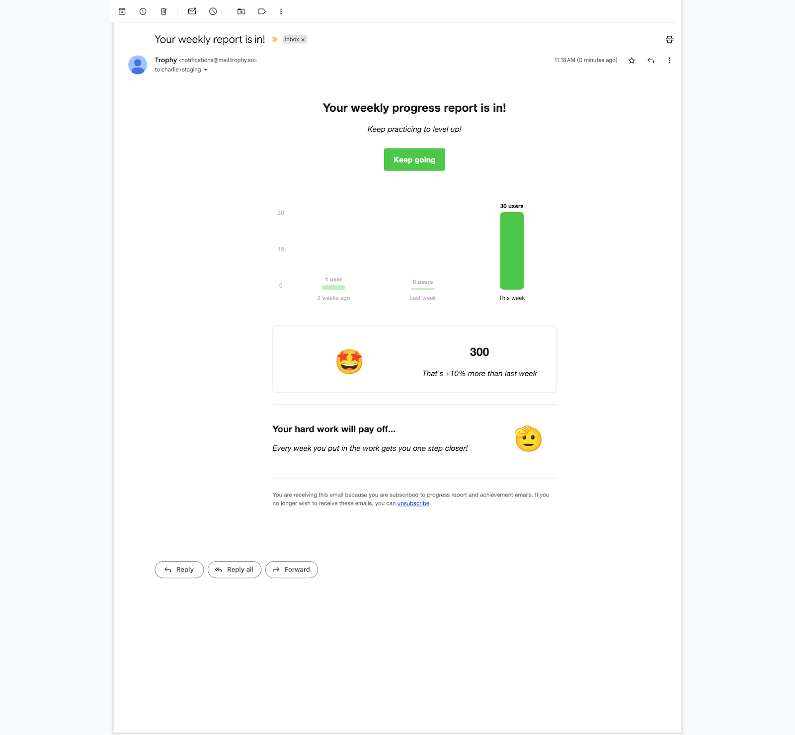
The key advantage is integration with Trophy's in-built behavioral tracking system. As users interact with your product, their data automatically flows into the chart blocks, enabling true personalization at scale. Whether you're sending to hundreds or hundreds of thousands of users, each recipient sees their unique data visualized in real-time.
All charts render as clean, responsive HTML and CSS optimized for inboxes. They work consistently across Gmail, Outlook, Apple Mail, and mobile clients without external dependencies or deliverability concerns. Screen readers can interpret the underlying data structure, ensuring full accessibility compliance.
Getting Started with Trophy
Trophy makes it simple to begin building HTML charts into your email marketing with no code. The platform offers a generous free tier that allows unlimited emails to up to 100 monthly active users, ideal for early-stage companies testing charts in emails.
To learn more about building effective email campaigns that build app culture and boost retention, check out our detailed guide on how to design gamified lifecycle emails with Trophy.
Sign up now and start using charts in emails easily.
Get the latest on gamification
Product updates, best practices, and insights on retention and engagement — delivered straight to your inbox.