How to Measure XP and Levels Across All Users (Without a Data Warehouse)

Across apps on Trophy's platform, users who complete metric achievements at the highest difficulty level (where the threshold is 30 to 100 times their average daily activity) retain at 74%. Users completing achievements that require less than one day's average activity retain at 32%. That gap is more than twice the retention rate, and it comes entirely from how the achievement system is calibrated, not from the feature being present or absent.
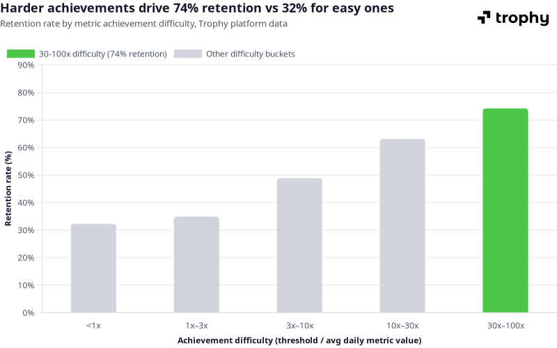
Source: Trophy platform data, April 2026. 14-day retention rate vs achievement difficulty, where difficulty is defined as the achievement threshold divided by the average daily activity volume.
Most teams shipping XP and levels never see a number like that for their own app. They know users have levels — they don't know what percentage of users are stuck at Bronze, whether Silver actually predicts retention, or whether their progression curve is set right. The data exists; it just isn't surfaced anywhere without a data pipeline.
This post covers the questions worth asking about your points and levels system, how the typical analytics tool path works and where it creates overhead, and what Trophy surfaces natively without a warehouse.
The Four Questions That Actually Matter
Before reaching for tools, it helps to be precise about what you're trying to learn. Most product teams working on XP and levels are really asking four things:
How are my users distributed across levels right now? If 80% of users are at Bronze and almost nobody reaches Silver, either the curve is too steep, Silver doesn't offer enough incentive to push for, or the user base isn't sufficiently engaged with the core activity. You can't tell which without the distribution.
Where is the progression curve breaking down? A healthy distribution typically tapers — lots of Bronze, fewer Silver, fewer still Gold. A cliff at a specific level means something is wrong at that transition: the activity required is too high, the reward for reaching it isn't visible enough, or the cohort reaching that point is churning before completing it.
Does reaching a level actually predict retention, or is it decorative? This is the question most teams never answer. Levels look good in the product. Whether users who reach Silver retain at meaningfully higher rates than those who don't is a separate question — and the answer determines whether the system is doing any work or just occupying screen real estate.
Is the engagement trend moving in the right direction? Levels are a snapshot. Engagement is a trend. A static level distribution that's improving week-on-week is different from one that's flat — and only a time series shows which you have.
The Data Warehouse Path
The standard answer for cross-user analytics is to pipe events into an analytics platform: Mixpanel, Amplitude, BigQuery, Snowflake. This works correctly and makes sense for teams already operating a warehouse for other product analytics. The integration points with Trophy are clean: the points.level_changed webhook streams level transitions as they happen, and points.changed streams every XP award.
// Pipe level changes to your warehouse via webhook handler
app.post('/webhooks/trophy', async (req, res) => {
  const event = req.body;

  if (event.type === 'points.level_changed') {
    const { user, points, previousLevel, newLevel } = event;

    // Write to your warehouse or analytics platform
    await analytics.track({
      userId: user.id,
      event: 'Level Up',
      properties: {
        pointsSystem: points.key,
        previousLevel: previousLevel.key,
        newLevel: newLevel.key,
        pointsTotal: points.total,
        timestamp: new Date().toISOString(),
      },
    });
  }

  res.sendStatus(200);
});
Once level events are in your warehouse, you can join them to retention data, build cohort analyses, and answer the questions above with whatever query layer you use. The data model is straightforward: each points.level_changed event is a row with userId, fromLevel, toLevel, timestamp, and pointsTotal.
For teams without an existing warehouse, though, standing up a pipeline to answer gamification-specific questions is significant infrastructure overhead. Trophy surfaces the most common answers directly.
What Trophy Surfaces Natively
Level distribution across all users
The level summary API returns a breakdown of user counts at each level in a points system — a direct answer to "how are my users distributed right now" without any querying:
import { TrophyApiClient } from '@trophyso/node';

const trophy = new TrophyApiClient({ apiKey: process.env.TROPHY_API_KEY });

// Get the count of users at each level for the 'xp' points system
async function getLevelDistribution() {
  const summary = await trophy.points.levelSummary('xp');

  // Returns an array of levels with user counts
  // e.g. [{ key: 'bronze', name: 'Bronze', userCount: 4821 },
  //        { key: 'silver', name: 'Silver', userCount: 634 },
  //        { key: 'gold',   name: 'Gold',   userCount: 87  }]
  return summary;
}
Pull this on a weekly schedule and store the snapshots — even just in a spreadsheet — and you have a time series of level distribution without any pipeline work.
Points distribution across all users
The points breakdown API returns users bucketed by points range, which is where the progression curve problems are visible at a finer grain than level labels alone:
// Get a breakdown of users by points range
async function getPointsDistribution() {
  const breakdown = await trophy.points.summary('xp');

  // Returns buckets showing how many users fall in each points range
  // A cliff between two adjacent buckets signals a sticking point
  // in the progression
  return breakdown;
}
A level distribution showing 80% at Bronze tells you there's a problem. The points breakdown tells you whether those Bronze users are clustered near 0 XP (not engaged at all), near the Silver threshold (almost there but not converting), or spread evenly (disengaged across the board). Each pattern implies a different fix.
Per-metric retention analytics
Every metric tracked in Trophy has its own retention dashboard showing the retention rate of users who engaged with that metric versus those who didn't. This is the mechanism for answering "does reaching a level actually predict retention" — not just for XP, but for any interaction you track.
The retention view compares users who performed the tracked action against those who didn't, across your configured retention window. If lessons completed shows 40% 30-day retention for users who logged at least one lesson versus 15% for those who never did, you have a number — not a hypothesis.
The control ratio — measuring gamification's impact directly
Trophy's built-in A/B testing splits users automatically into a control group (no gamification) and an experimental group (gamification active). Trophy withholds all gamification features — points, achievements, streaks, emails, notifications — from control-group users. The analytics dashboards then compare retention and engagement between the two groups.
This answers a question that Mixpanel and Amplitude struggle with: not "do users with high XP retain better" (which is confounded — engaged users earn more XP regardless of whether gamification helped) but "does the gamification system itself cause better retention?" The control group is the counterfactual, and Trophy manages the split automatically.
Configure it from the Integration page in the Trophy dashboard. The control field returned on user API responses lets you conditionally hide gamification UI from control-group users in your own frontend, keeping the split clean.
What Good Achievement Calibration Looks Like — and How to Read Your Own Data
The platform-wide numbers from Trophy's infrastructure give a useful benchmark. Across all apps on Trophy's platform, retention increases monotonically with achievement difficulty:
| Achievement difficulty | Retention rate |
|---|---|
| <1× | 32% |
| 1×–3× | 35% |
| 3×–10× | 49% |
| 10×–30× | 63% |
| 30×–100× | 74% |
Source: Trophy platform data, April 2026. 14-day retention rate vs achievement difficulty, where difficulty is defined as the achievement threshold divided by the average daily activity volume.
The practical implication: if your level summary shows most users clustered at Bronze — which corresponds to low-difficulty achievements — those users are in the 32–35% retention cohort. Moving them into harder achievement territory isn't about making the game more difficult; it's about ensuring the goals are meaningful relative to what users are already doing. An achievement that requires exactly what a user does anyway is no more motivating than no achievement at all.
How to read your own distribution against this: pull the points breakdown, compare the achievement thresholds you've set to average daily metric values in Trophy's metric analytics, and calculate your own difficulty ratios. If the majority of your completions are happening in the <1x or 1x–3x bucket, there's a calibration problem worth fixing before attributing flat retention to the gamification feature itself.
Measuring Beyond XP — Tracking Cross-Feature Interactions
Because Trophy's measurement is built on metrics — which track any user interaction, not just gamification actions — you can add purchases, onboarding completions, feature activations, or any other event as a tracked metric. Once an interaction is tracked in Trophy, it gets the same retention and engagement analytics as any gamification metric.
This means questions like "do users who make a purchase within their first 7 days retain better than those who don't?" are answerable from Trophy's retention dashboard without joining to a separate data source — provided purchases are tracked as a metric. The same applies to any interaction you care about.
The early engagement charts — which Trophy shows specifically for users within their configured activation window — are particularly useful here. They show metric-by-metric engagement for users in their first days, which surfaces which early interactions predict long-term retention and which are noise. That's the data that should drive which achievements and XP triggers you build around.
A note on scope: Trophy's per-metric retention analysis shows whether users who engaged with a given metric retained better. For questions that require joining multiple data sources outside Trophy — revenue attribution, support ticket correlation, ad spend efficiency — a dedicated analytics warehouse remains the right tool. The points.level_changed and points.changed webhooks are the integration points for those flows.
FAQ
What's the difference between Trophy's level summary API and querying my own database?
If levels are managed in Trophy, the authoritative user count per level lives in Trophy's infrastructure — not your database. Querying your database only works if you're mirroring Trophy's level state back into your own tables, which requires additional sync logic. The level summary API is a single call against the system of record, with no sync required.
Can I get a time series of level distribution, not just the current state?
The level summary and points breakdown APIs return current state. For a time series, the simplest approach is to schedule a daily or weekly call to both APIs and store the snapshots yourself — even a basic cron job writing to a spreadsheet or database table gives you a trend line without warehouse infrastructure. The points.level_changed webhook is the event-level alternative if you want full granularity: every level change as it happens, available to stream into whatever store you prefer.
How does Trophy's control ratio help me measure the impact of XP on retention?
The control ratio assigns a percentage of new users to a group that receives no gamification features. Trophy withholds points, achievements, streak tracking, and all gamification-triggered emails and notifications from these users automatically. The retention and engagement dashboards then compare the two groups, giving you a true causal read on whether gamification is driving retention improvement rather than just correlating with engaged users. Set the ratio from the Integration page; 10–20% in control is typically sufficient for statistical signal without meaningfully reducing the number of users experiencing the full product.
Can Trophy replace my product analytics tool for measuring engagement?
For gamification-centred engagement questions — is XP driving retention, which achievements correlate with long-term use, where users stall in the progression — Trophy's built-in analytics cover the most important queries without an external tool. For broader product analytics that span multiple features outside Trophy's scope, or for custom SQL queries against your full event history, a dedicated analytics platform remains the right choice. The two aren't mutually exclusive; many teams use Trophy for gamification analytics and a warehouse for everything else, with the Trophy webhooks as the bridge.
How do I know if my XP curve is calibrated correctly?
Pull the points breakdown to see where users cluster relative to your level thresholds. Then compare your achievement thresholds to average daily metric values in Trophy's metric analytics — that ratio is your difficulty score. Completions clustering in the <1x or 1x–3x buckets indicate achievements that are too easy relative to normal usage. The platform benchmark (32% retention at <1x, 74% at 30–100x) is a useful calibration reference: if most of your completions are in the easy buckets, adjusting thresholds upward — or creating a harder tier of achievements — is the highest-leverage change you can make to the system before blaming the feature for flat retention numbers.
Where to Go Next
For the mechanics of building the XP and points system itself — trigger configuration, level setup, and the event API — the Trophy Points documentation covers the full reference. The Trophy Experimentation overview explains the control ratio and how retention and engagement analytics are calculated.
If you're building the XP feature from scratch and need the implementation walkthrough alongside the measurement layer, How to Build an XP Feature covers the end-to-end integration. And for the per-user operational question — how a single user's XP stays consistent across their devices — How to Sync XP Across Devices Without Firebase covers the server-authoritative model in detail.
Get the latest on gamification
Product updates, best practices, and insights on retention and engagement — delivered straight to your inbox.